What Can I Expect From Advanced Grower Solutions Customer Service?
April 27, 2022
Why Growers Should Compare Time Historical Periods
May 31, 2022Growers have complicated data situations. Making sense of what your grower software data is telling you quickly and accurately helps improve a grower’s operational decisions and grower software efficiencies.
One way to help you make sense of your data is through the use of data visualizations.
Data Visualization is the graphical representation of large amounts of information and data, curated together to build a visual data story for simple understanding, research and decision making.
Data Visuals Are Better For Understanding
The human brain can process information via visuals easily over thousands of rows of data in a spreadsheet. We can distinguish different colors – green from red, different shapes – square from circle and interpret information very quickly. We can see trends and outliers through charts and histograms, and that is what data visualization does. The process of data visualization assembles different visuals together for a purposeful storytelling of a business/organization over “Big Data” across single or scattered data sources.
Picture 1 – Large Dataset for Simple Production Plan vs Actual (Difficult to Analyze and Interpret)
Copyright Advanced Grower Solutions

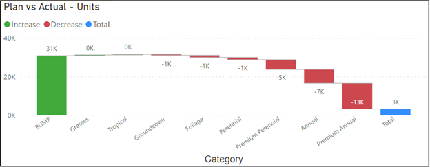
Picture 2 – Visualized Data for Plan vs Actual (Actionable Insights)
Copyright Advanced Grower Solutions

Which Visual Is Best To Illustrate Your Data?
Picture 1 and Picture 2 represent the same data set. Which one yields an understanding of the relative situation of a given category of grower plants faster?
Use The Right Visuals For Your Data
Data visualization is important, but what is equally important is to put the right visual in place for the context. It is important to understand what and why you are trying to analyze from your business data. You can do comparative analytics, trend analysis, distribution analysis, etc. using Data Visualization tools. But, if the wrong visuals are put on display for any kind of analysis, it could lead to confusion and misinterpretation of the story that is being told.
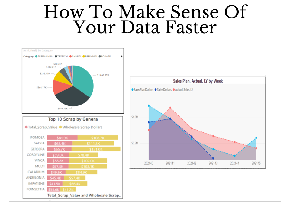
You don’t want to put a Pie Chart for something that you want to compare. You don’t want to put a Tree Map for analyzing trends.
Here are some examples of some simple visual aids and in what context they should be used:
Types of Data Visuals
Comparison Data Visuals
When you need to show the relationship between 2 data elements or values. Comparisons can be categorical (or with other meta) or across time values.
- To compare one data value to the other use these data visuals:

Copyright Advanced Grower Solutions
Composition Data Visuals
To show the constituents of a value or what sub areas compose a given data value use a composition type chart of visual.
- To show the composition of data:

Copyright Advanced Grower Solutions
Let the AGS Data Team Help Improve Your Data Story
Advanced Grower Solutions has extensive experience working with complicated data models and disparate data sources for all types of growers and nurseries. From ERP Data (Sage X3), and standalone SQL databases to raw Excel, and CSV files, we have successfully joined, merged, and cleaned underlying datasets and put together automated actionable visual flows for organizations that help in quick insights, decision making, and take away a lot of manual and redundant data reporting working. We hold expertise in understanding data requirements, preferences and information needed and help build strategic solutions.
If you feel, your organization needs help and support and building self-service Business Intelligence and Reporting solutions for you, please contact us.
Author
-

Sharat Prakash helps businesses transform through technology and process modernization. He has championed multiple technical projects – ERP implementations, BI implementation, and Business Planning System implementation, thus helping organizations through digital transformation.


